
OVERVIEW
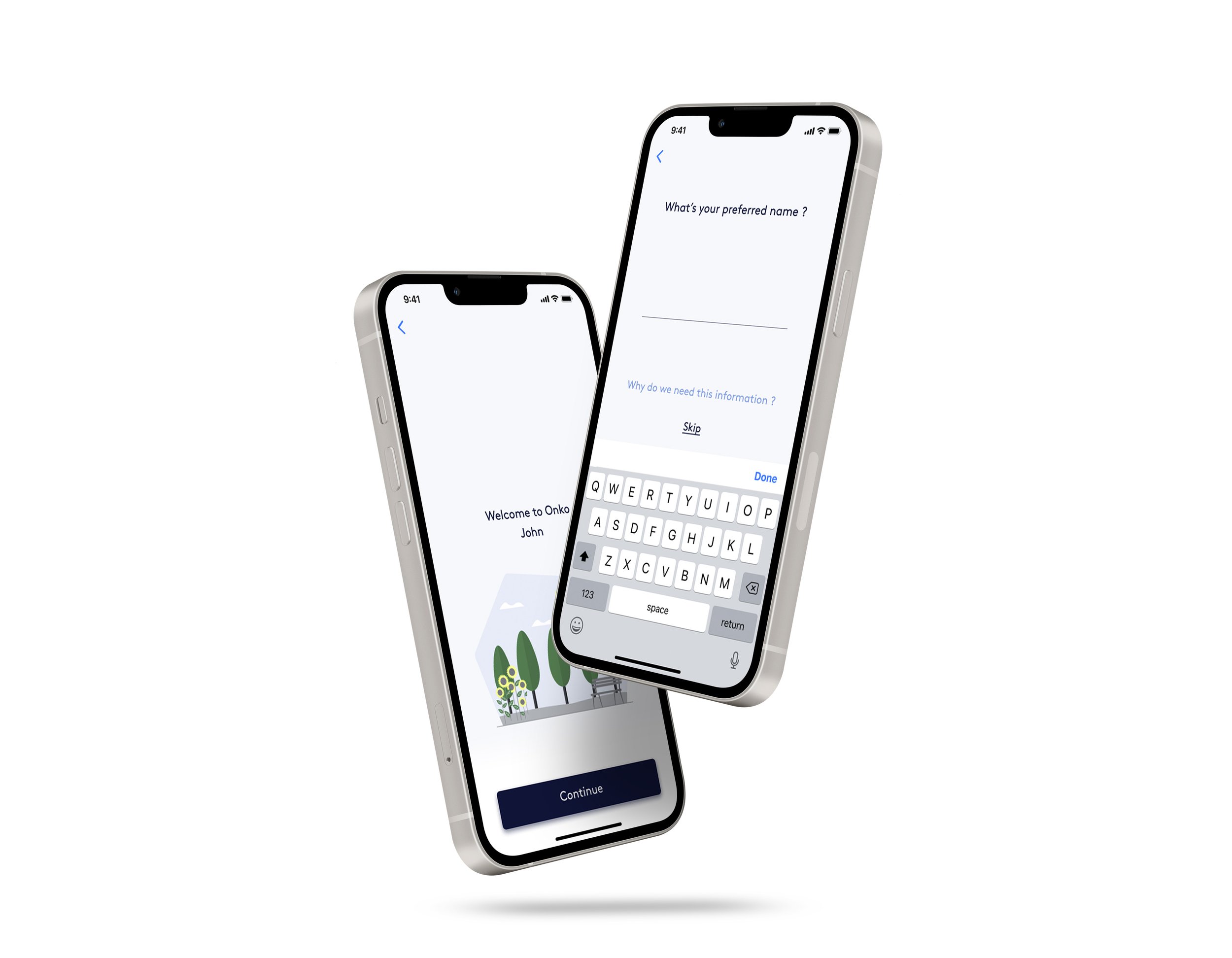
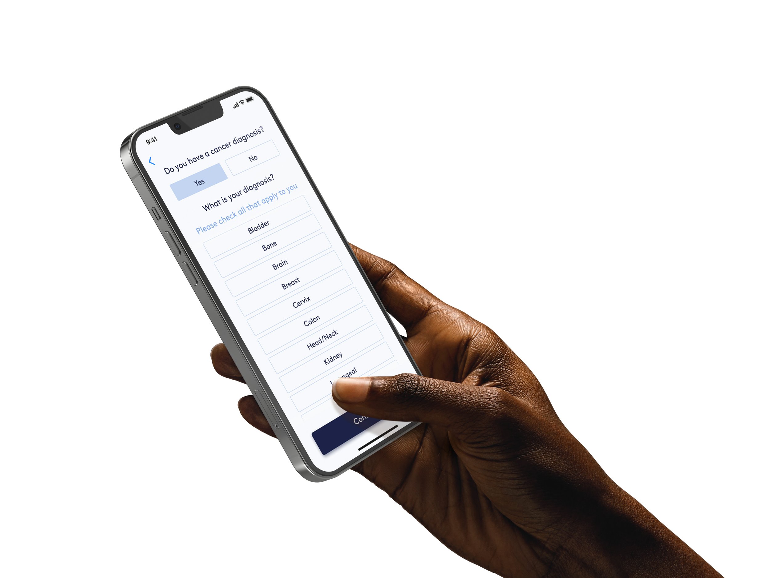
The app onboarding flow is the first process that patients need to go through when opening the app for the first time. This stage brings value to the app, if a user struggles at this point they are more likely to get a low engagement and lack of adoption towards the app, this would then impacts app adherence.
Tools: Microsoft teams, Zoom, Slack, Confluence, Figma
CHALLENGES
Patients are from all different age, accessibility needs to be prioritised
Make sure the flow does not contain any struggle for the user
Illustrate the content of the programme in a limited number of screens
WHY ARE WE BUILDING THIS?
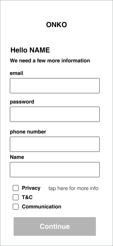
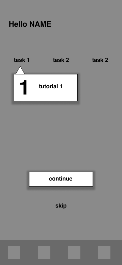
This process was described as laborious by both the patients and the clinical team. We needed to streamline the process by making it trustworthy and as simple as possible for the patients, increase its automation avoiding the Onko staff spending time doing admin work, by manually onboarding the patients and catching the right data.
GOALS
Increase patient’s trust toward the app and the management of their data
Make sure the data captured during the onboarding process is reflected on the clinical dashboard
Reduce the time spent on onboarding, taking patients on the app faster
PROTOTYPING
LOW FIDELITY


TESTING
PLAN
Having fully redesigned the design system, as well as implemented new functionality, it was essential for us to test the most used elements of our design system now deployed on the onboarding process of the app.
Having difficulties testing with cancer patients, we used an external platform to find specific user groups that could match our different personas. This platform allowed us to record unmoderated testing, finding if our user flow was coherent and if there was any our accessibility had any raising issues.
FOCUS
interface colour
accessibility
copy size
data capture
new functionalities (integration of apple health/fitbit)
elements of the newly designed design system
OUTCOME
Copy size has been standardised and we have opted for the use of one only font
One of the light blue was not readable enough, we have darken it when used on text
CTA buttons are fully usable and accessible
User flow and data input are understood by the users
HIGH FIDELITY